Decision Design: When Dashboards Actually Drive Action
We say we want to be data driven, but a lot of dashboards never actually change anything.
I still remember the meeting that finally broke the spell for me.
Big screen on the wall.
Clean layout. Trend lines. Color coding. Someone had clearly spent time getting the dashboard just right.
At one point a leader leaned in and said, “Can you filter that by region?”
We clicked. The chart shifted. Heads nodded. Someone added, “That is interesting.”
We captured one vague action item. Moved to the next slide. Kept going.
Walking out of that room, I felt it in my gut.
We had spent twenty minutes looking at data and nothing, in practice, had changed.
The report ran.
The visuals rendered.
The meeting happened.
A decision did not.
That was the moment I started to see the real gap. Not between raw data and dashboards, but between dashboards and behavior.
You see this everywhere. Organizations proudly describe themselves as “data driven.” Training catalogs and leadership programs all say the same thing: use data to make better decisions. The research backs it up. Companies that use data well are far more likely to improve decision quality, not just reporting (Harvard Business School Online, 2019; McKinsey & Company, 2022).
But the reality on the ground is quieter and more uncomfortable.
Those same organizations still sit through meetings just like the one I was in that day, where everyone looks informed and nothing actually moves.
Most places are not suffering from a dashboard shortage.
They are suffering from a decision shortage.
We keep adding more views, more filters, more “insights.” The people in the room nod along, ask for one more slice of the data, and then fall back into the same habits as last month. What we really need is not more charts.
We need clearer calls.
I want to be fair to dashboards here. They are not the villain.
I have seen them do exactly what they are supposed to do. A good dashboard can help someone spot a trend before it becomes a fire. It can surface a pattern a spreadsheet would bury in row 2,384. It can give people a shared picture to gather around so at least we are starting from the same reality.
McKinsey talks about the move toward a truly data driven enterprise, where information is woven into decisions, interactions, and processes instead of living off to the side (McKinsey & Company, 2022). Dashboards and analytics absolutely have a role in that story. They are part of the nervous system.
The problem is not that dashboards are bad. The problem is that we often treat them as finished.
We ship the report, give it a name, send out the link, and mentally check the box. Somewhere under that is a quiet assumption we rarely say out loud: if the right people can see the data, they will know what to do with it.
What actually happens is familiar.
People review the dashboard in meetings, then go back to their own offline files. Leaders nod, then ask for one more cut of the numbers. Teams spend more time explaining the report than deciding anything.
Researchers have been warning about this for years. Big data brought a management revolution, but it also created an illusion that more information automatically leads to better choices (McAfee & Brynjolfsson, 2012). More information often just gives us more ways to hesitate or second guess. Luca and Edmondson (2024) go further and show how data driven decision making can go wrong when organizations focus on numbers without examining how they are interpreted and used in practice.
I have been on both sides of this. I have built the dashboard that quietly landed with a thud. I have also sat in the audience, staring at charts that were technically correct and practically useless. At some point I had to be honest with myself.
A dashboard without a decision path is just a very expensive mirror.
Once I saw that pattern, I could not unsee it.
We were strong on tooling and visualization. We were weak on what happened next.
We were very good at showing the current state. We were vague about what the organization should actually do in response. We were generating awareness, not commitment.
That is where a phrase started to form in my own head.
Decision design.
For me, decision design is the missing layer between dashboards and behavior. You can call it decision intelligence or decision engineering if you prefer. The label matters less than the habit. It is the simple discipline that sits on top of your data work and asks a few direct questions for every metric that truly matters:
- When this number moves, who owns the call?
- What level of change is serious enough to trigger a response?
- What action should happen first?
- How quickly should that action happen in the real world, not the ideal one?
If those questions are fuzzy, the dashboard will always feel fuzzy too.
I have seen teams physically relax when they finally answer them. They know the difference between “interesting” and “actionable.” The metric stops being a conversation piece and starts being a commitment.
The data did not change.
The design around it did.
If you want to sketch decision design in one line, it looks like this:
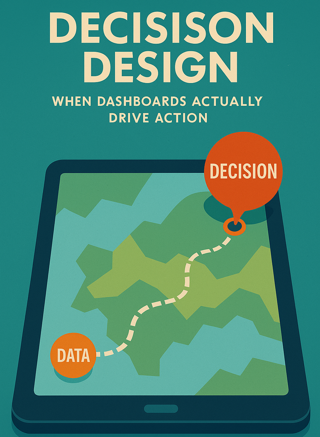
Metric → Owner → Trigger → Action → Time frame
That is it. No complicated canvas. No twelve step model. Just a clear path that says: when this moves, here is who moves with it, and here is how fast.
Years ago, Davenport and Harris argued that the real advantage of analytics comes from consistent, repeatable decisions, not just clever tools (Davenport & Harris, 2007). Decision design is what makes that consistency possible. It is how analytics grows up from “interesting insight” to “this is how we run the business now.”
One of the most helpful shifts I have used in my own work is very small, but it changes everything.
Instead of asking, “What should we show,” I ask, “What happens when they see it.”
Take something familiar like on time shipment.
In many organizations, the pattern looks like this. The dashboard shows a dip this month. Someone asks for context and a few reasons. A general concern gets voiced. An action item is captured that nobody truly feels responsible for. The next month looks very similar.
The screen changed. The behavior did not.
Now picture the same metric, but wrapped in a clear hypothesis; if this, then that structure.
For example, if on time shipment falls below a defined threshold for two consecutive weeks, then the owner of that metric schedules a focused review within a set number of days. The purpose of that review is simple: agree on one change, assign an owner and a due date before anyone leaves the room.
Same data. Different system.
The dashboard stops being a static picture. It becomes a trigger.
It will not magically repair a broken process, but it does remove the ambiguity around what happens when the line crosses a certain point. People know who moves first. They know what “doing something” actually looks like. They know when it should happen.
I have watched rooms get quieter in a good way when this clicks. There is less debate about whether the problem is real and more energy on what the response will be. The conversation shifts from “Is this bad” to “What are we going to do about it.”
You do not need a complicated decision framework to support this. The loop I keep coming back to is very simple:
See it.
Own it.
Act on it.
Learn from it.
Healthy data and good dashboards primarily support the first two steps.
See it.
When the signal is wrong or arrives too late, everything downstream is guesswork. You are arguing about shadows, not the thing itself.
Own it.
When no one clearly owns the metric, the problem stays abstract and nobody feels responsible to move first. Everyone is concerned. No one is accountable.
Once those two are solid, the human work takes over.
Act on it.
When taking action is optional, dashboards turn into theater. Meetings become recurring status updates instead of moments of choice. The numbers scroll by, everyone is “aligned,” and nothing changes.
Learn from it.
When you never review whether the action worked, mistrust quietly returns. People start to doubt both the data and the process around it. You find yourself back at the beginning, staring at a chart and not believing it.
Harvard’s work in this space is blunt. Data can absolutely help decisions, but it also introduces new failure modes when leaders chase metrics without examining the systems that generate and interpret them (Luca & Edmondson, 2024). The loop is simple. The discipline is hard.
What I have noticed is that when data health improves, it is usually the first part of the loop that changes. People can finally see what is happening. Ownership gets stronger as governance matures and stewards are named.
The next frontier is to be just as intentional about acting and learning.
That is where decision design lives. And like anything else that matters in organizations, the power comes from repetition, not novelty. You do not need a new framework every quarter. You need a simple loop that people actually run.
If you want something concrete to try, start small. Do not overhaul your entire portfolio of dashboards.
Pick one that hurts a little.
The one tied to a backlog that refuses to come down.
The one tied to inventory that swings harder than it should.
The one tied to a service metric that keeps getting escalated.
Bring together the people who stare at that page most often and walk through five questions:
- Which two or three metrics on this dashboard actually matter to you?
- For each one, who owns the call when that number moves the wrong way?
- What specific threshold should trigger a response?
- What is the first action you expect when that threshold is hit?
- How quickly should that action happen, realistically, in your world?
You are not trying to engineer the perfect system in one meeting. You are trying to turn at least one metric into a clear commitment.
What usually surfaces is not a visualization problem. It is a clarity problem.
Someone will say some version of, “We talk about this number every week. We have never written down what we will do when it crosses the line.”
That is the moment you remember why the data work matters.
The graphs were never the point.
The agreements were.
When you approach dashboards this way, things start to shift.
Meetings get shorter, or at least more focused. You spend less time narrating the current state and more time debating tradeoffs, priorities, and real constraints. The data becomes a starting point, not the whole conversation.
Teams feel less defensive. The report stops feeling like a surprise attack and becomes part of a shared rhythm everyone understands. People know when the conversation is coming and what will happen in it.
Leaders change their questions. Instead of starting with “Is this right,” the first questions become “What are we going to do about it” and “What will it take to change this line.”
You also move closer to the kind of organization so many analysts describe, where data is not simply collected and visualized, but embedded in how everyday decisions actually happen. Not in theory. In the calendar. In the way people show up on Monday morning.
Quietly, confidence begins to grow.
Not because every metric is perfect.
Not because you automated every response.
Confidence grows because people can finally feel the connection between what they see and what they do. The system starts to feel trustworthy. That is what all the technology and data work was supposed to buy you in the first place.
I still enjoy a well designed dashboard. I like when information is clear and patterns pop. But after enough meetings where nothing moved, I had to be honest.
The goal is not better reporting.
The goal is better decisions.
Healthy, well governed data makes that possible. Decision design makes it real.
If you have already done the hard work to get your data right, this is the next step. Take that hard won trust in the numbers and turn it into a simple, repeatable way for those numbers to drive action.
Not just once in a big transformation moment.
Over and over, in the daily rhythm of the business.
If you chose just one dashboard in your world and turned it into a true decision system, which one would change the most for your team?
Sources
Davenport, T. H., & Harris, J. G. (2007). Competing on analytics: The new science of winning. Harvard Business School Press.
Harvard Business School Online. (2019, August 26). The advantages of data-driven decision making. Harvard Business School. https://online.hbs.edu
Luca, M., & Edmondson, A. C. (2024). Where data-driven decision making can go wrong. Harvard Business Review, 102(5).
McAfee, A., & Brynjolfsson, E. (2012). Big data: The management revolution. Harvard Business Review, 90(10), 60–68.
McKinsey & Company. (2022, January 28). The data-driven enterprise of 2025. McKinsey Analytics. https://www.mckinsey.com